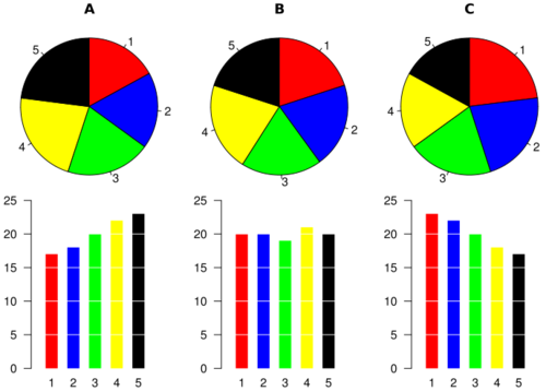
For a long time now I’ve been explaining why pie charts are a bad visualisation. I’ve been complaining when they get used. Even worse, sometimes they are fake 3-D (where the 3rd dimension is not a new fact, just there to make it ‘pretty’). Today I was in a presentation on data visualisation and, unsolicited by me I swear, the presenter brought up this fact, using this example below to demonstrate.
Most people, if they just saw the 3 pie charts (independently), would say the numbers were roughly equal. They are not.
Worse, imagine if someone is doing a time series (last quarter, this quarter, next quarter), you cannot compare. Use a bar, a stacked-bar, or a line.
In “Save the pies for dessert” there are more examples and a more in-depth view on why.
As for the raisins? Yes, they belong in pies, and particularly, in butter-tarts.
Leave a Reply